ShopDreamUp AI ArtDreamUp
Deviation Actions


Suggested Deviants


Suggested Collections


You Might Like…


Featured in Groups


Description
Hey  (Smile)")
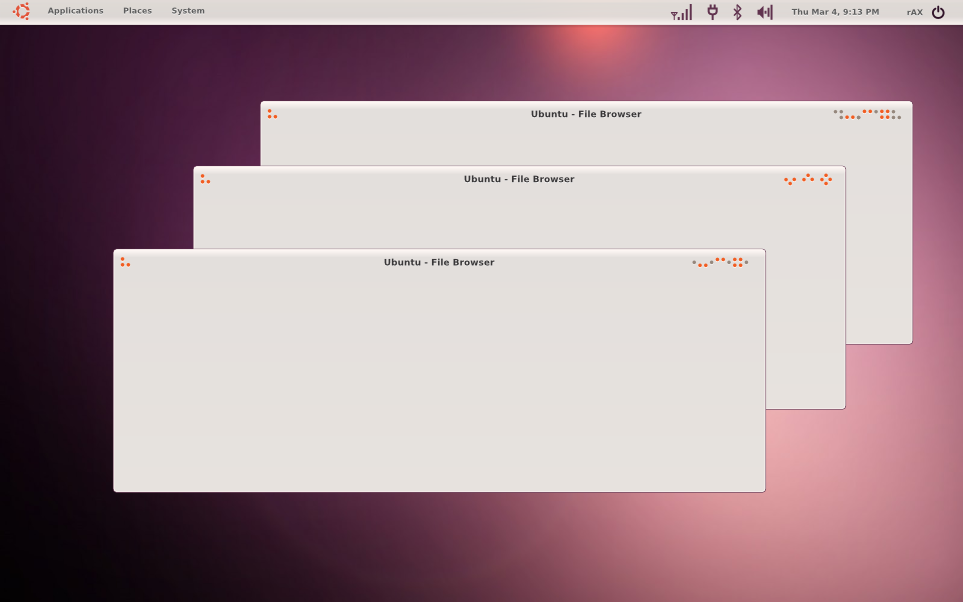
I have seen the new Ubuntu identity (logo, color palette, artworks...) this morning like everybody else, I was so excited to see the new logo, I'm really happy about the way they did it.
While I'm scrolling down trying to find the screenshot that has the metacity theme "Light" I was really disappointed to see it") everything was really REALLY great, they included a beautiful purple that looked hot! even the wallpaper is way better than the previous ones IMHO, the splash screen is awesome too. My only problem is with the metacity+GTK+icons = The whole theme.
everything was really REALLY great, they included a beautiful purple that looked hot! even the wallpaper is way better than the previous ones IMHO, the splash screen is awesome too. My only problem is with the metacity+GTK+icons = The whole theme.
First, the buttons they look so out of place, the idea is outdated and the orange/red button doesn't match anything in the desktop!
Second, the GTK is so simple!
Third, the icons are trying to match the new theme so hard without succeeding, they really need to replace the orange color with something more appropriate, and that's a shame because they're here since Karmic (~6 months)...
Anyway, that's what I think, I'm 99% sure that what we saw is just a work in progress, so please give us something to like.
About the work:
started with the idea of consistency, I collected the colors from the brand pages, also I've got the idea of the metacity from the CD cover concept (found on the page 2 [link]).
I'm not saying that my work is better than Light, nor that this is what they should give us, I just wanted to make something with the new palette that in my opinion doesn't suck.
Well, please let me know what you think
UPDATED:
Added 2 more variations!
I have seen the new Ubuntu identity (logo, color palette, artworks...) this morning like everybody else, I was so excited to see the new logo, I'm really happy about the way they did it.
While I'm scrolling down trying to find the screenshot that has the metacity theme "Light" I was really disappointed to see it
First, the buttons they look so out of place, the idea is outdated and the orange/red button doesn't match anything in the desktop!
Anyway, that's what I think, I'm 99% sure that what we saw is just a work in progress, so please give us something to like.
About the work:
started with the idea of consistency, I collected the colors from the brand pages, also I've got the idea of the metacity from the CD cover concept (found on the page 2 [link]).
I'm not saying that my work is better than Light, nor that this is what they should give us, I just wanted to make something with the new palette that in my opinion doesn't suck.
Well, please let me know what you think
UPDATED:
Added 2 more variations!
Image size
963x602px 136.7 KB
© 2010 - 2024 0rAX0
Comments30
Join the community to add your comment. Already a deviant? Log In
Does it work with gnome3??